MOTION PROJECTS
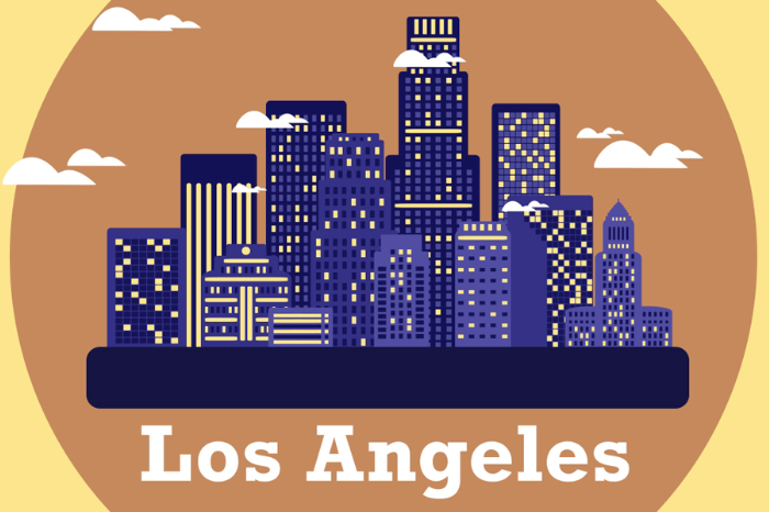

WELCOME TO LOS ANGELES
Motion Graphic Design
Motion Graphic Design
"Welcome to Los Angeles" is a motion graphic created to showcase the city of Los Angeles. A static shape mixed with a couple of moving elements is a style that is used very rarely in the design industry, but is effective. This style was inspired by postcards but with an added twist of movement instead of a static image. Examples from the design include the static Princess Castle from Disneyland, but with fireworks launching and exploding around it or the Ferris wheel rotating on the Santa Monica Pier. Colors also capture the feel of each area in Los Angeles.

WE'VE COME A LONG WAY
Motion Graphic Design
Motion Graphic Design
"We've Come A Long Way" is a motion graphic depicting the advancements of humanity throughout the ages beginning with the discovery of fire to the age of broadband internet and streaming content and everything in between. From the very beginning creative transitions between the different scenes and objects were the focus. A seamless transition from one object to another conveys to the audience a sense of connection. An example would be the rotating wheel transforming into a film reel rather than having a quick cut from the wheel rotating to the film reel.
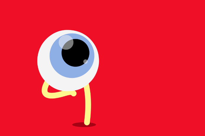
LOOK OUT!
Motion Graphic Design
Motion Graphic Design
The goal of "Look Out!" was to create a short and entertaining motion graphic that combines text and graphics in a unique and creative way. Shapes shift and transform into other shapes. Attention to detail includes a lot of key-framing and animating individual frames so that the motions and animations flow smoothly.
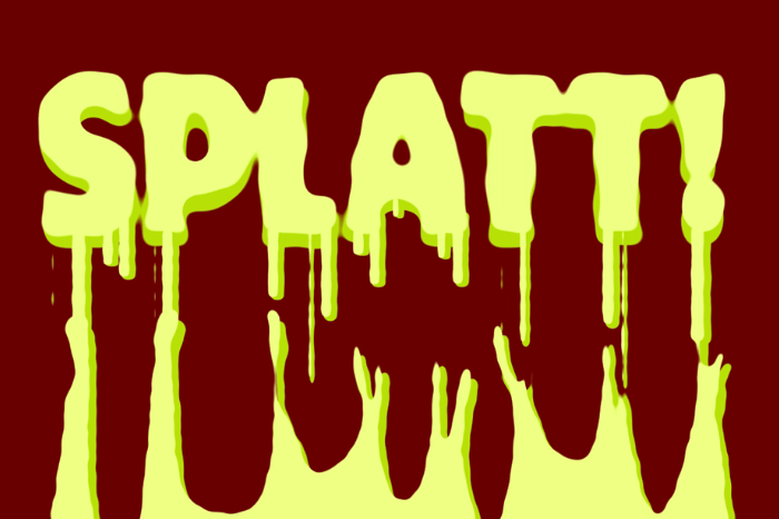
SPLATT!
Motion Graphic Design
Motion Graphic Design
"SPLATT!" is an animated motion graphic title screen. The goal of the design was to create a title screen that feels gross, but is whimsical too. Green and yellow colors represent toxicity as well as the gooey thick viscosity too. The design took a lot of work animating individual keyframes to get the slime trails looking just right and so that the liquid slides off the screen realistically.
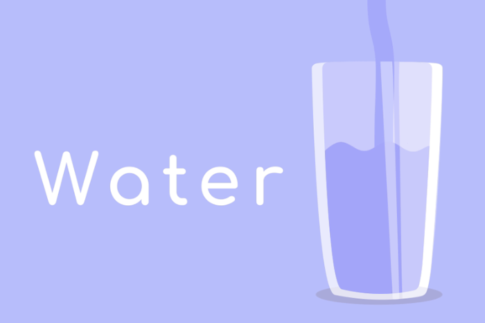
THE BENEFITS OF DRINKING WATER
Motion Graphic Design
Motion Graphic Design
"The Benefits of Drinking Water" is a motion graphic created to educate the public about water consumption. Fun, but also educational was the main goal of the design. White is used for the text and various shades of blue is used for the majority of the graphics and background. Both of these colors were chosen because they represent purity and cleanliness. Green is also used for the word "toxin" because of its association with poison. A constant flow from one scene of the design to the next without much pause in between represents the flow of water.


Designed and Coded by Richard Lim